
To disseminate the results of research, it is important that the data is clear and understandable.
This project uses data visualization to achieve this in the field of molecular epidemiology,
for research on the different kinds of day activities of a patient.
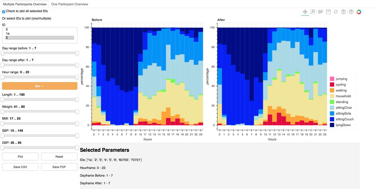
After uploading the data on patients, a GUI shows two tabs, single and multi.
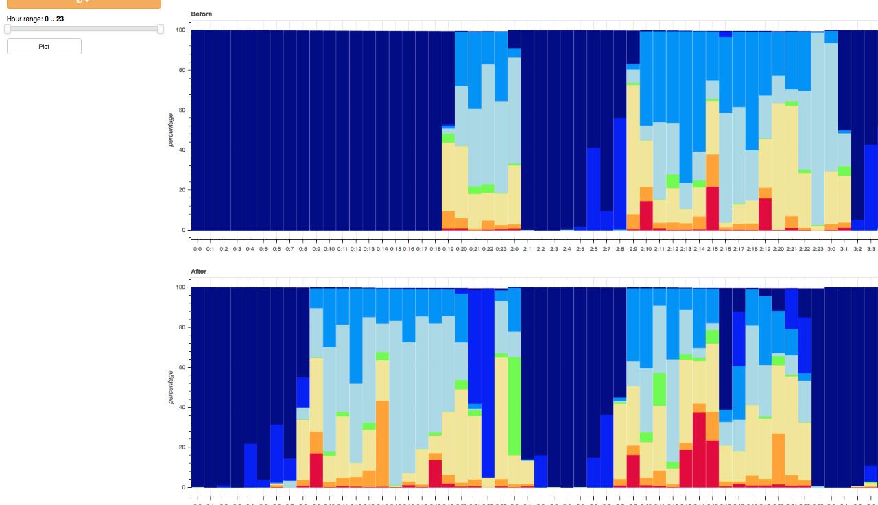
The single tab shows data of a singular patient. The multi tab
makes it possible to select a specific group based on selected filters, for example gender and age. On the
multi tab one can also compare two groups based on their specifics.
The input data measures the amount of
time a patient spends on a specific activity, before and after an intervention. The tool makes it
easy to compare different kind of groups and it also give the user the opportunity to play with the data.
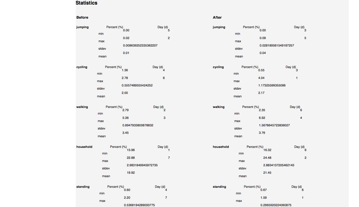
Several plots show statistical details, based on the selected filters.
This project is built to be user friendly and the code is well documented,
in order to allow others to continue the project.
Our customer was the Biomedical Data Sciences department of the Leiden University Medical Center (LUMC). PhD candidate Stelios Paraschiakos was our weekly contact and we also elicited requirements from his supervisor dr. Marian Beekman.
Our team consisted of six members: Four computer science students and two computer science and economics students. Twice a week we worked on the project and once a week we met with the client. During the meeting without the client, all team members worked on a shared vision. After the meeting, the tasks were split among the team members, who worked on them in their own time. The atmosphere in the team was good. The team members were taking initiative and had a possitive attitude towards the project.